 VIEW
VIEWDOMS operates in a category full of colourful products and similar claims. The opportunity was to make the product range feel like an invitation to create, not just a catalogue of stationery.
Same shelf.
Same category.
A different imagination.
Let each tool demonstrate its own imaginative possibility. Product form, colour and playful transformation become the campaign language across film, posters, range communication and retail.
The DOMS Brand World
A foundational visual and film system that establishes a bright, inventive personality around the full stationery universe.
The DOMS Brand World · Print 01
The anchor execution. Product and illustration merge into a single playful composition that sets the visual tone for the entire stationery universe.
The DOMS Brand World · Print 02
A different product takes centre stage, proving the visual system flexes across the range without losing its inventive character.
The DOMS Brand World · Print 03
Colour pencils become the subject. The layout grammar holds steady while the palette shifts to match the product personality.
The DOMS Brand World · Print 04
The system extends into a new product category, demonstrating that the brand world can accommodate variety without visual compromise.
The DOMS Brand World · Print 05
Another layer of proof. The creative discipline remains tight even as the product story expands across the stationery shelf.
The DOMS Brand World · Print 06
Broadens the world into yet another product without diluting the core idea. Each tool gets its own moment of imaginative possibility.
The DOMS Brand World · Print 07
The series comes full circle. A different product, the same confident visual grammar that makes every DOMS print feel like part of one family.
Play campaign filmThe DOMS Brand World · Film 08The DOMS Brand World · Film 08
The brand world comes alive in motion. Colour, product transformation and playful energy translate the print system into an animated film experience.
Erase the Ordinary
An eraser story that turns a small functional product into a playful creative device, using surprise to make the benefit memorable.
Erase the Ordinary · Print 01
A poster that turns a small eraser into a visual punchline. The product benefit becomes the concept itself — surprise through disappearance.
Play campaign filmErase the Ordinary · Film 02Erase the Ordinary · Film 02
The eraser story in motion. Timing, reveal and a child-friendly sense of mischief give the functional benefit an entertainment value.
Metallico Groove
A product-led launch where finish, form and youthful energy give a pencil range its own distinctive attitude.
Metallico Groove · Print 01
The metallic finish is the hero. Photography and lighting are tuned to make the pencil surface feel premium and tactile on the page.
Metallico Groove · Print 02
A variant colour extends the range. The same visual treatment ensures shelf coherence while giving each finish its own personality.
Metallico Groove · Print 03
The third colourway completes the launch trio. Together, the posters form a coordinated display that commands retail attention.
Play campaign filmMetallico Groove · Film 04Metallico Groove · Film 04
Motion adds what print cannot: the tactile groove of the pencil, the shimmer of the finish, and the rhythm of a young hand drawing.
The Pencil Portfolio
A clear range architecture that differentiates products while preserving one strong DOMS visual signature.
The Pencil Portfolio · Print 01
The flagship pencil. Hero product photography establishes the design language that every variant in the portfolio will follow.
The Pencil Portfolio · Packaging 02
Packaging architecture on display. The range is organised so a parent or student can navigate confidently from drawing pencils to writing pencils.
The Pencil Portfolio · Print 03
The colour pencil range. A shift in palette signals a different purpose, but the composition and hierarchy stay unmistakably DOMS.
The Pencil Portfolio · Print 04
Superio enters the frame. A premium tier within the portfolio, given just enough visual distinction to signal its elevated positioning.
The Pencil Portfolio · Print 05
Karbon — the dark-lead specialist. Product photography isolates the distinctive barrel while the layout stays within the portfolio system.
The Pencil Portfolio · Print 06
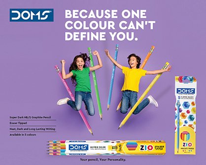
Zio closes out the range. A youth-forward variant that proves the visual system can accommodate personality shifts without breaking.
Ideas in the Real World
Mock-ups and applied expressions showing how the brand’s playful graphic language holds together beyond a single advertisement.
Ideas in the Real World · Print 01
A mock-up placing the brand world into a physical retail context. The playful graphics hold their energy even at environmental scale.
Ideas in the Real World · Print 02
The visual language on a screen-based surface. Digital signage and social formats prove the system translates beyond print.
Ideas in the Real World · Print 03
A landscape application demonstrating how the graphic language holds together across wider formats and environmental scales.
Ideas in the Real World · Print 04
Point-of-sale expression. The brand personality stays intact even when reduced to a compact shelf talker or counter display.
Ideas in the Real World · Print 05
An exhibition mock-up showing the brand identity on large-format panels, proving the design system scales from pack to pavilion.
Ideas in the Real World · Print 06
Applied signage in a store environment. The illustration style remains visible and legible against the visual noise of a retail setting.
Product Posters with Personality
A poster system that gives individual products a hero moment while using imaginative visual metaphors to communicate what each one enables.
Product Posters with Personality · Print 01
Wax crayons as heroes. The poster gives a familiar classroom staple a moment of visual drama through scale and saturated colour.
Product Posters with Personality · Print 02
Colour pencils step forward. A different product hero, but the same poster system keeps the series instantly recognisable.
Product Posters with Personality · Print 03
The geometry box. A more complex product given its own visual metaphor, proving even utilitarian tools can carry personality.
Product Posters with Personality · Print 04
Poster colours take their turn. Liquid pigment and vivid splashes give this execution a messier, more expressive energy.
Product Posters with Personality · Retail 05
A whiteboard-marker poster designed for the retail environment. The visual metaphor shifts to a classroom context where the product lives.
Product Posters with Personality · Print 06
The X1 pen series. A more grown-up product given the same playful treatment, extending the DOMS world beyond the classroom.
Product Posters with Personality · Print 07
Aqua sketch pens. Water and colour intermingle in the composition, letting the product benefit speak through the visual itself.
Product Posters with Personality · Print 08
Erasers revisited in the poster system. A smaller product receives the same hero treatment, maintaining parity across the range.
Product Posters with Personality · Print 09
The pencil range presented as a family. Multiple variants share the frame, demonstrating breadth without sacrificing the poster format.
Product Posters with Personality · Print 10
A second pencil-range composition. The layout shifts to accommodate a different selection while the visual language stays coherent.
Product Posters with Personality · Print 11
Water colours close the series. Tubes and cakes share the poster, with the wet-media aesthetic giving this execution a distinctly fluid character.