Understand what is really at stake.
Beyond the category brief lies a human tension. That is where relevance begins.
 Purple FocusAI × Human Creative Company
Start something ↗
Purple FocusAI × Human Creative Company
Start something ↗
We begin with the pressure inside the brand problem: what people want, fear, hope for or struggle to say. Then we build one clear idea and give every expression a precise role.
Explore the work ↓AI widens the field of possibility. Human judgement decides what deserves to exist—and craft makes the chosen idea feel inevitable.
Beyond the category brief lies a human tension. That is where relevance begins.
A strong idea makes the strategy memorable and gives every discipline something useful to build from.
Film should move. Outdoor should interrupt. Packaging should help people choose. Nothing exists merely to fill a plan.
Film gives an idea time, performance and sound. These stories show three very different ways a brand can become emotionally present.
 Play filmJCB India
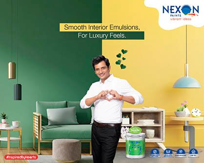 Play filmNexon Paint
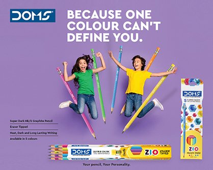 Play filmDOMS
Every case explains the brief, the strategic idea and the role of each creative expression—so the thinking is as visible as the finish.
View case study ↗Heavy machinery, recast as part of India’s ambition, celebration and everyday progress.
View case study ↗A warmer paint story built around expression, protection and the confidence to transform a space.
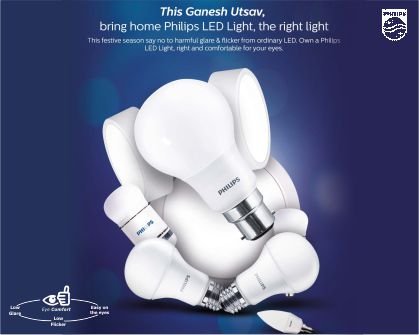 View case study ↗
Lighting communication that makes technology feel warmer, more useful and closer to Indian life.
 View case study ↗
A food brand built around auspicious beginnings, appetite and everyday cultural warmth.
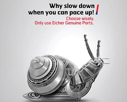 View case study ↗
Commercial-vehicle communication grounded in uptime, safety and the realities of working roads.
View case study ↗A stationery brand world where product demonstration and imagination share the same page.
 View case study ↗
A friendship-led cement story that turns strength into an enduring human bond.
 View case study ↗
Investment communication made clearer through relatable goals, memorable characters and disciplined information design.
 View case study ↗
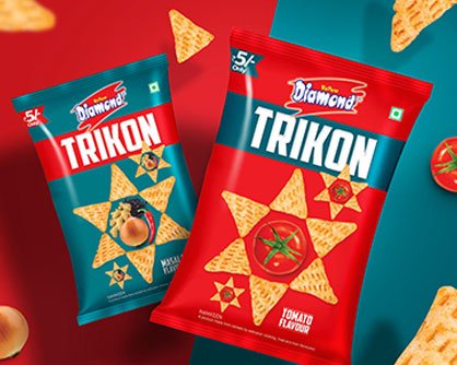
Snack communication with loud appetite, quick humour and a format built for instant recall.
 View case study ↗
Education communication reframed as momentum, confidence and visible possibility.
 View case study ↗
A premium real-estate language that gives each address distinction without losing the trust of the masterbrand.
 View case study ↗
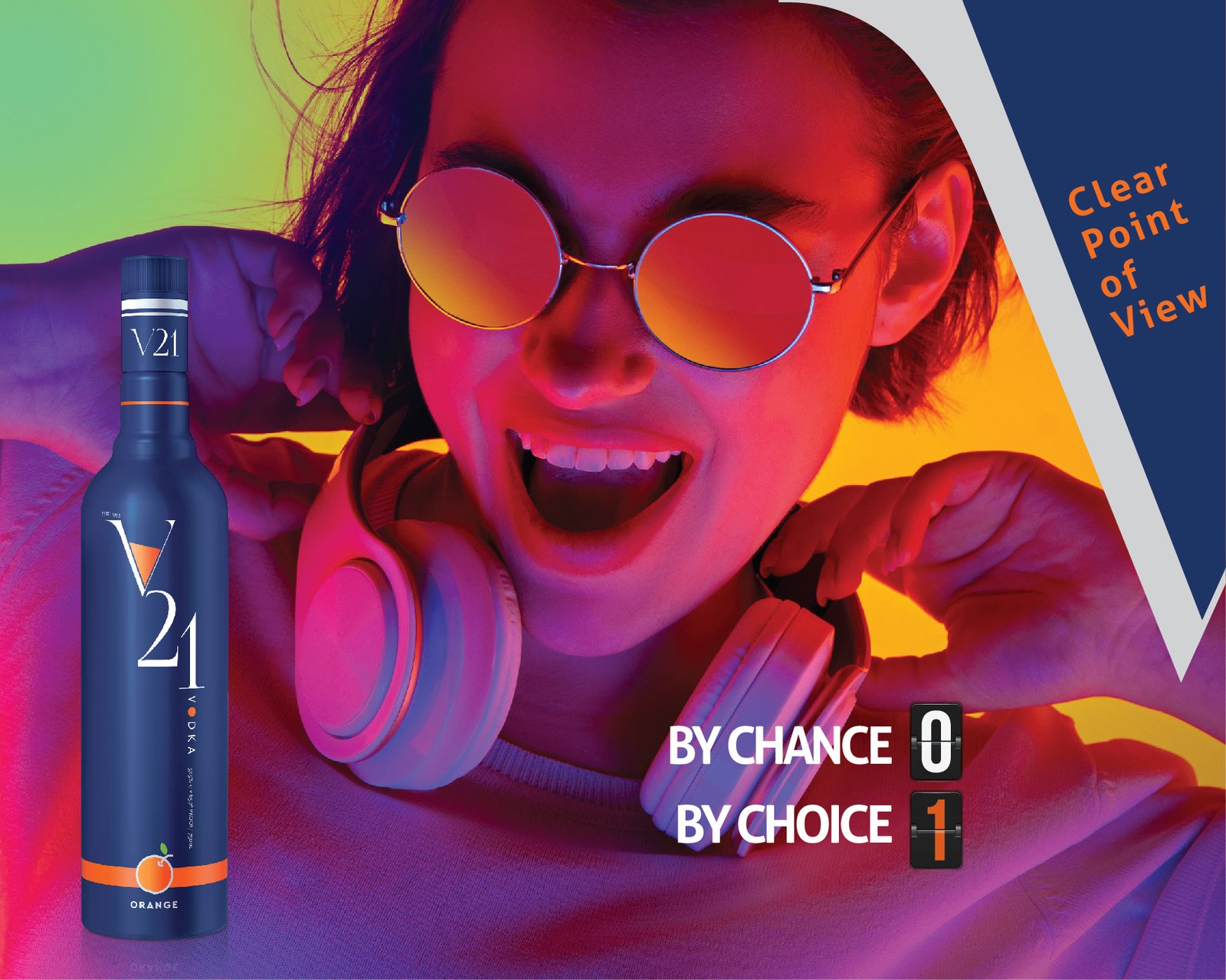
A whisky world made younger and more expressive through confidence, colour and occasion.
 View case study ↗
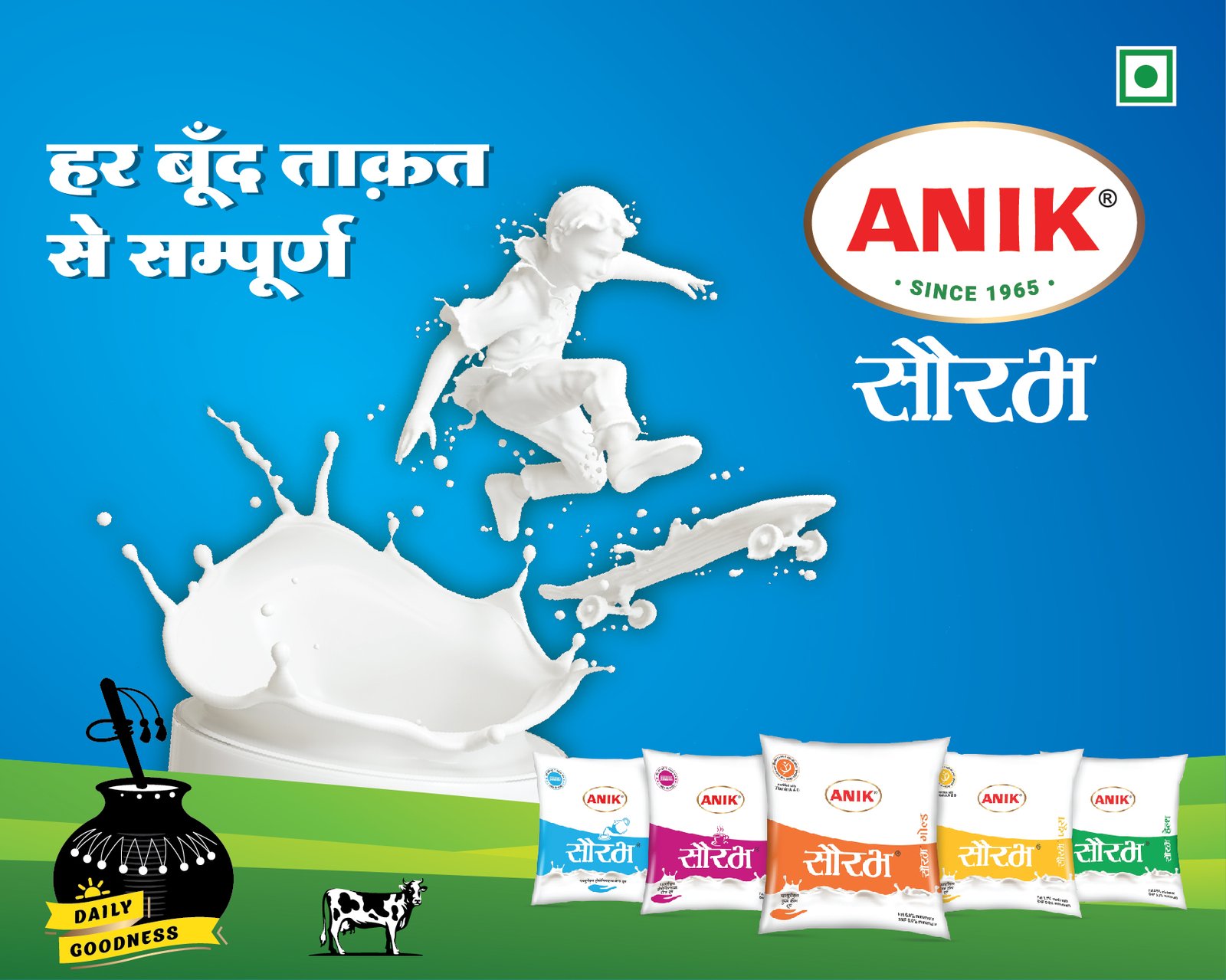
Dairy communication with regional warmth, product appetite and everyday familiarity.
 View case study ↗
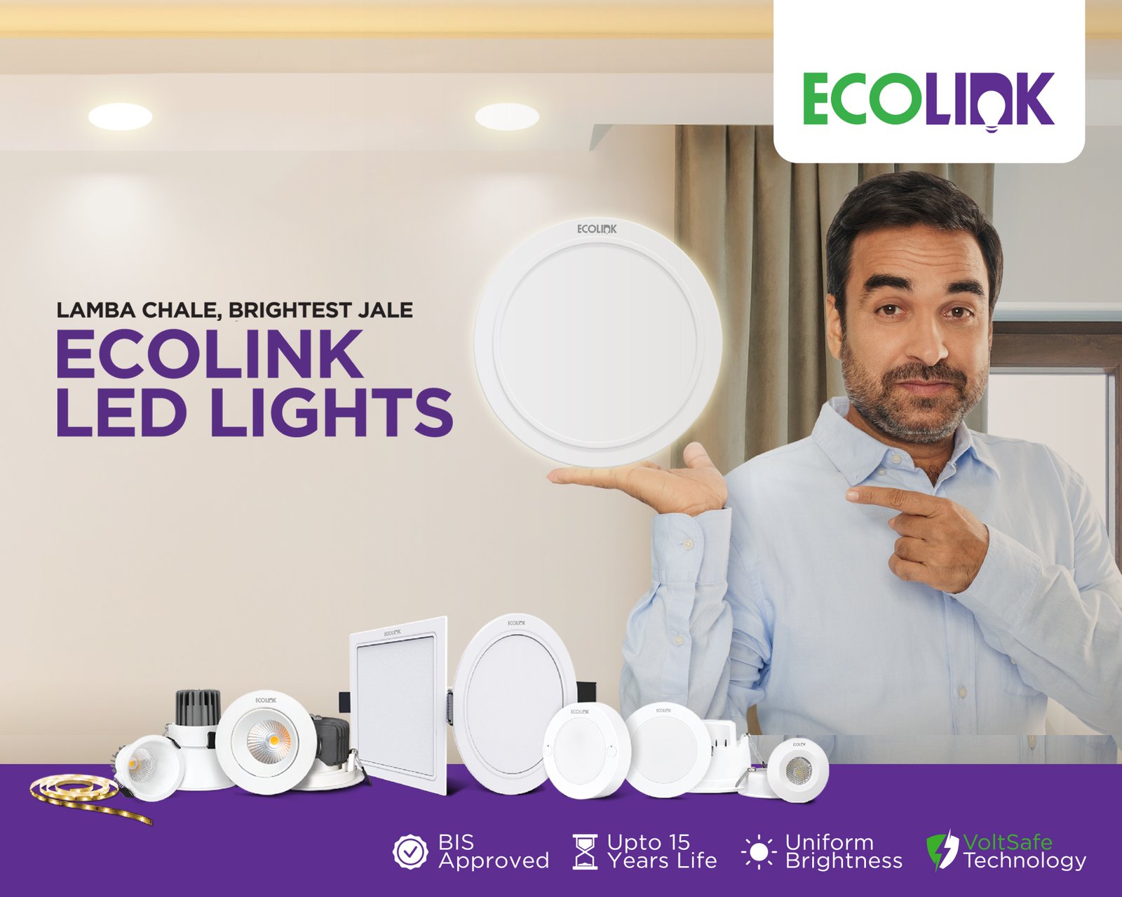
Efficient lighting made approachable through clear product stories and culturally relevant moments.
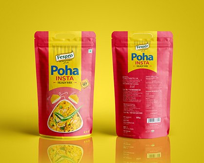 View case study ↗
A packaging system that gives a familiar breakfast staple cleaner shelf presence and stronger recognition.
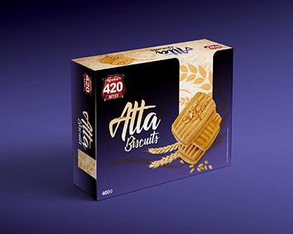 View case study ↗
A heritage food name refreshed through clearer packaging, stronger appetite and a coherent family look.
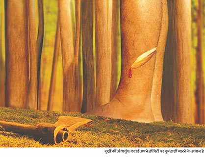 View case study ↗
Public-interest communication designed to turn attention into empathy and action.
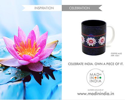 View case study ↗
Indian identity expressed through contemporary craft rather than predictable patriotic shorthand.
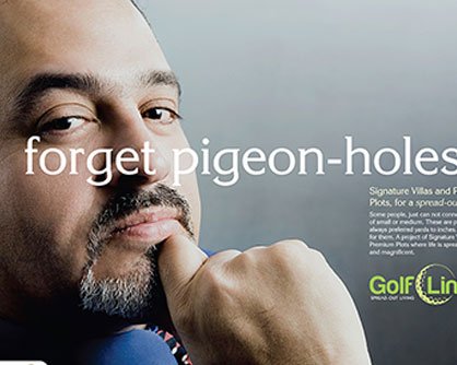 View case study ↗
Luxury real estate dramatized through scale, privacy and the details that change daily life.
 View case study ↗
Jewellery communication built around intimacy, occasion and the quiet theatre of desire.
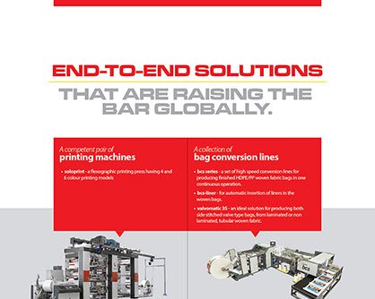 View case study ↗
Industrial capability presented with international confidence and contemporary precision.
 View case study ↗
A jewellery language where legacy, fashion and Indian occasion meet with confidence.
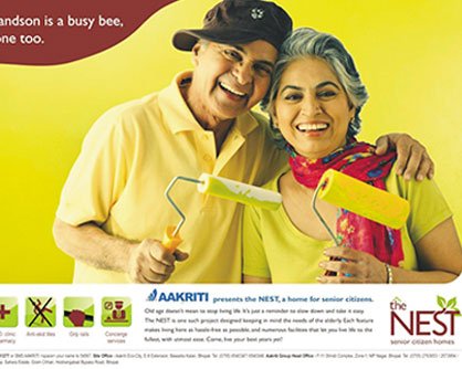 View case study ↗
Real-estate storytelling organised around the life a home enables, not only the structure being sold.
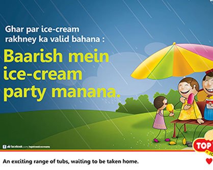 View case study ↗
Ice-cream communication filled with colour, craving and the uncomplicated joy of choosing a favourite.
 View case study ↗
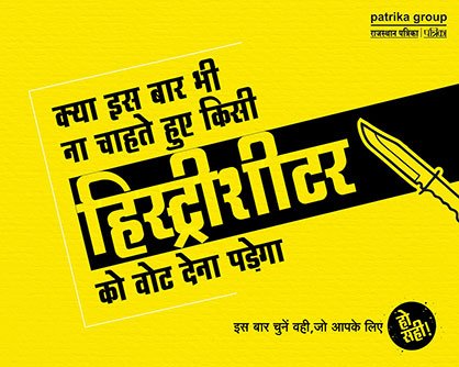
A publication kept culturally present through public ideas, reader trust and high-impact media thinking.
 View case study ↗
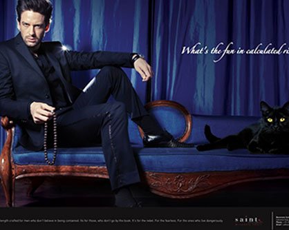
A premium textile proposition expressed through material confidence and modern restraint.
 View case study ↗
Fashion communication made expressive through colour, personality and a youthful graphic rhythm.
 View case study ↗
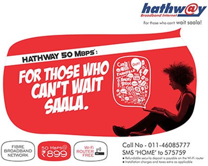
Connectivity communication with more entertainment, personality and everyday relevance.
 View case study ↗
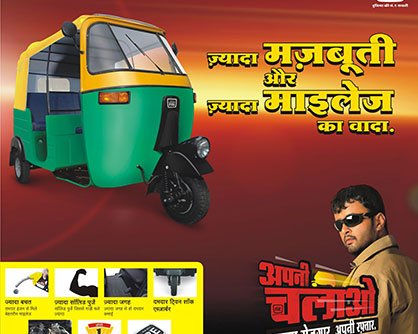
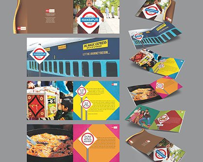
Mobility communication rooted in earning, reliability and the pride of independent progress.
 View case study ↗
Mass entertainment communication built on warmth, humour and a smile people can hear.
 View case study ↗
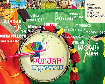
A destination story that moves beyond the postcard to reveal Punjab’s energy, generosity and many layers.
 View case study ↗
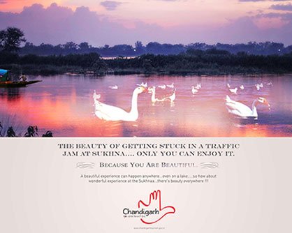
A modern city presented through the rhythm of architecture, gardens, culture and everyday ease.
 View case study ↗
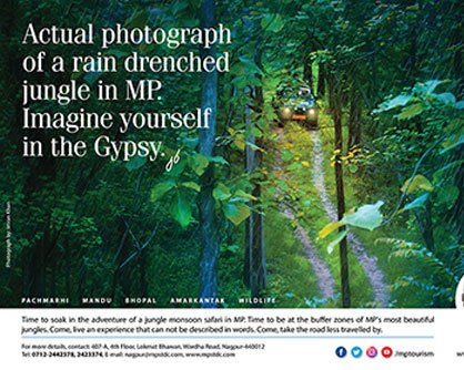
Madhya Pradesh made inviting through wonder, wit and a tactile collection of journeys.
 View case study ↗
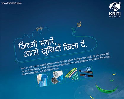
A functional category made memorable through character, humour and a strong sonic signature.
 View case study ↗
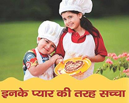
Everyday cooking oil brought closer to family life through warmth, mnemonic sound and familiar humour.
 View case study ↗
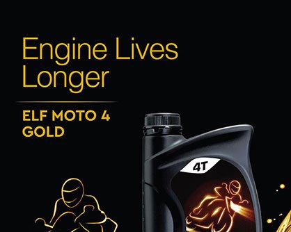
Lubricant communication that makes technical performance clear across automotive, industrial and retail contexts.
 View case study ↗
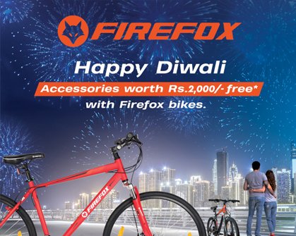
Cycling reframed as freedom, personality and a more energetic way to move through the city.